So everyone’s has their own particular *favorite style* of map. Browse r/mapmaking and you can see it breaks down into all sort of categories. Some people adore the real simple hand-drawn linework, or the iconic LOTR ink style. Others are all about the distressed parchment look, other still, the modern atlas.
Me? Deep down I’m all about the satellite look.
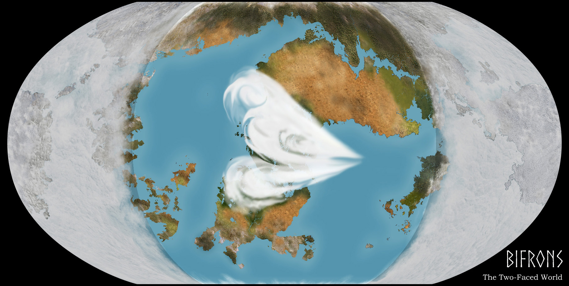
Nice top-down Google Earth style.
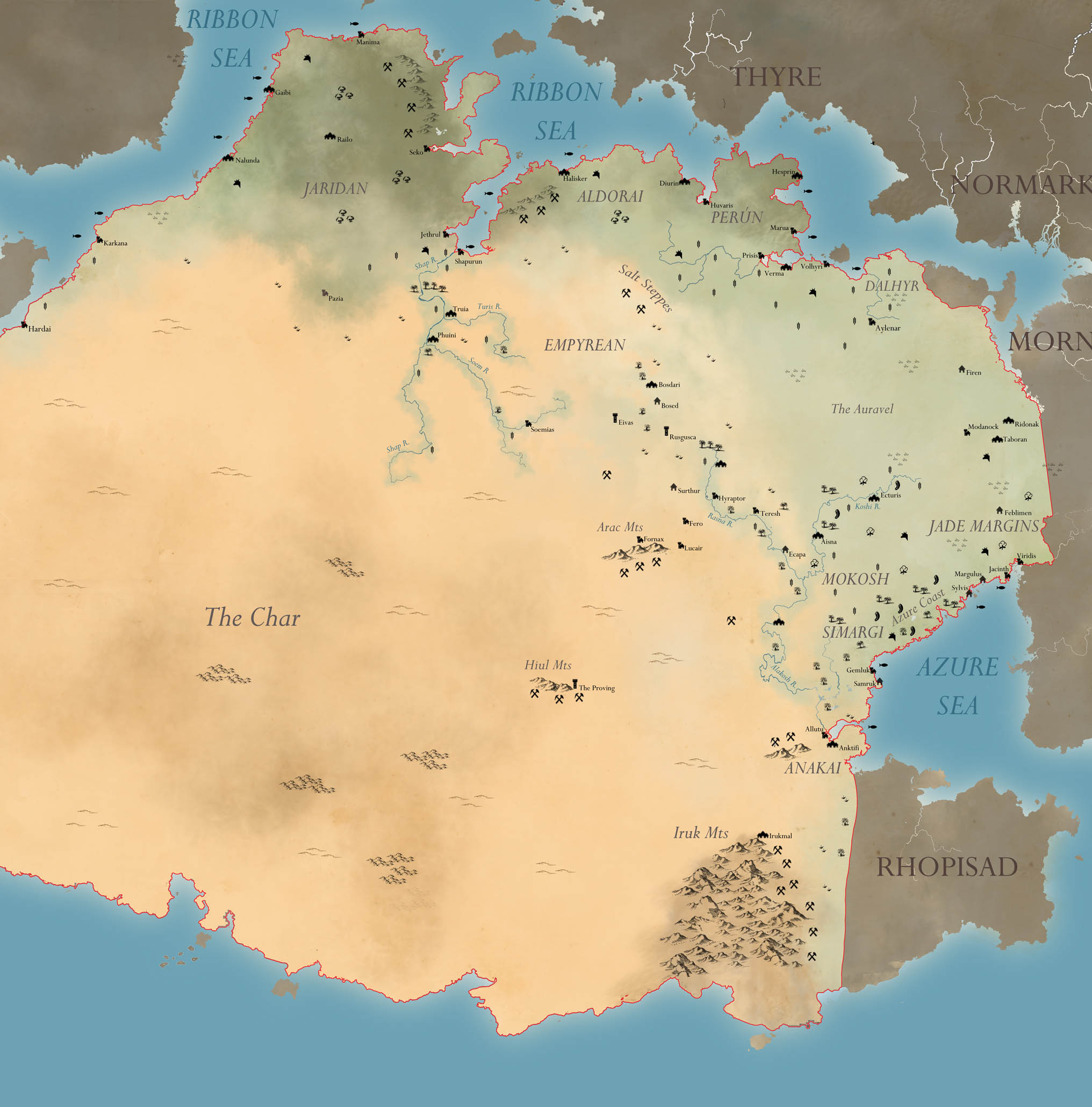
The problem as I may my “worldbook” -style info sheets, is that you can’t expect in-universe cartographers to be inking up satellite-style maps, surely. They’d be making 18th C style atlas maps, heavy on ink and low on color/accuracy. And I always love me some Tolkien-style mountains (I mean, who among us didn’t get into mapmaking from pouring over that LOTR map?)
So I compromised, and started making maps like these – sort of atlas-y, sort of parchment-y. Still some color to them.
But deep down, I knew it wasn’t enough for me.
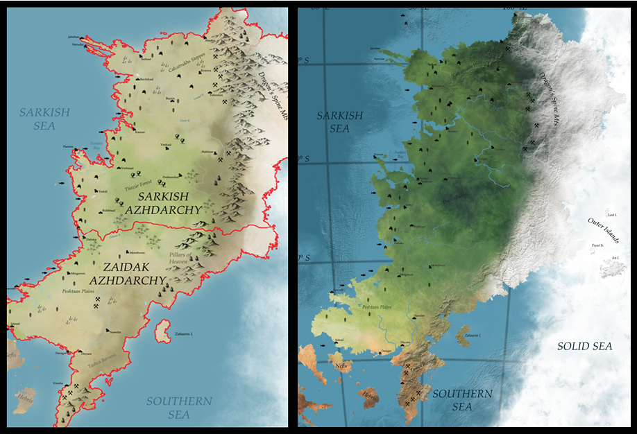
And then I bought some new Photoshop brushes. Behold the Evolution of Sarkland.
So yeah, big mapping overhaul underway.