I’m starting to do the final layouts and proofing for my novel East of the Sun, which I will be releasing with Amazon KDP. If all goes well, it could be ready by the end of March!
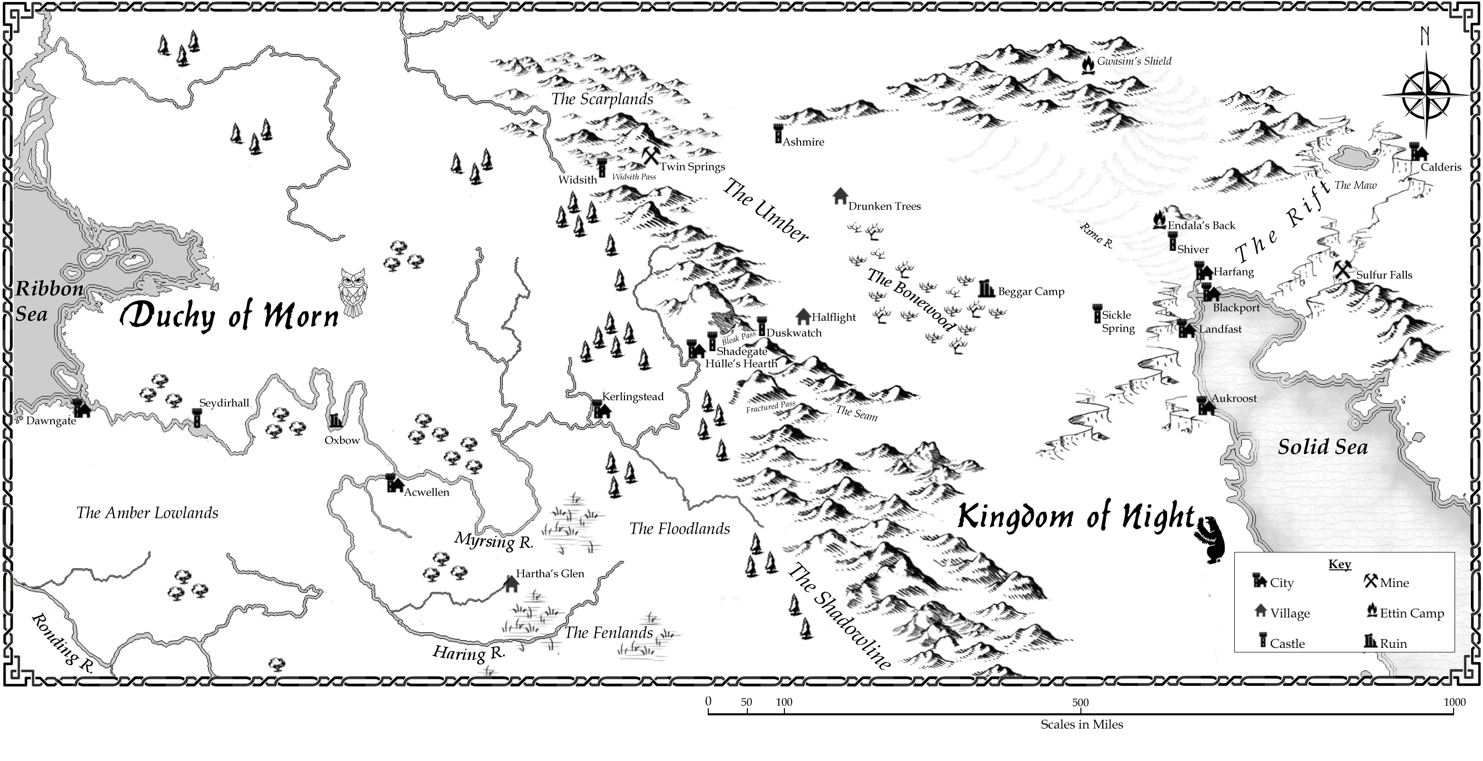
Asta Arvaker is the uncertain heir to the Duchy of Morn. She has been brought up to fear the brutal Nightsiders who live beyond the Shadowline Mountains, but when her claim to the throne is challenged, and her life is in danger, she has no choice but to journey east of the sun to seek the aid of the Nightsider prince.
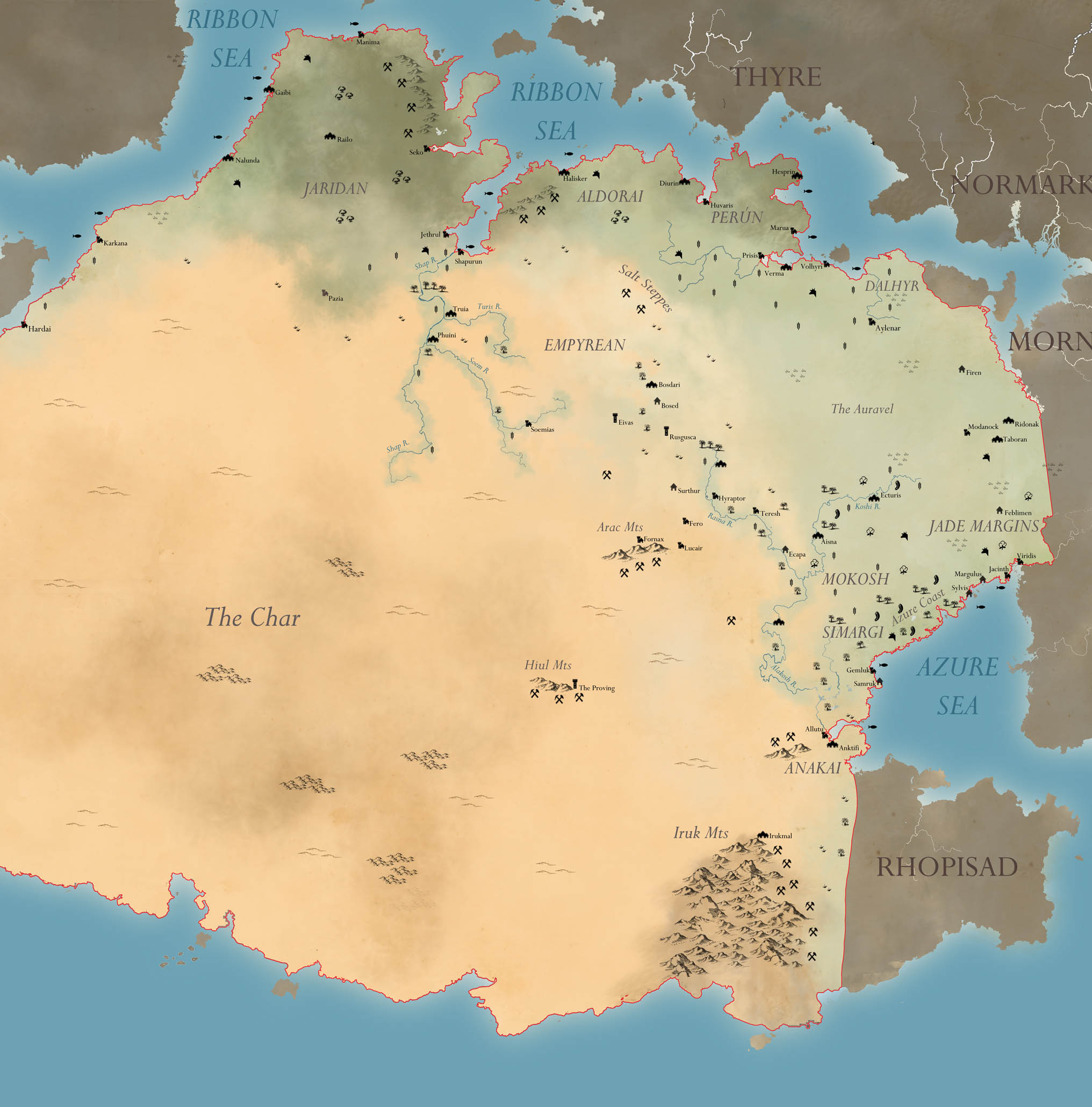
Here is the first of several maps that will be accompany the finished novel. This is the regional map, covering all the sites visited or mentioned in the text.
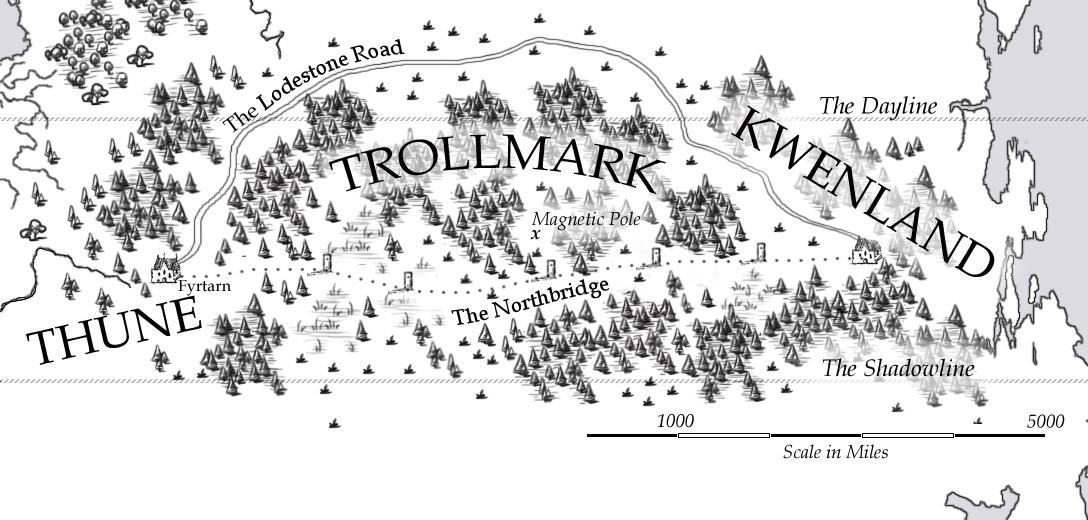
Exhibit 1 – the “reader friendly” version of the Northbridge, the dangerous trading route that goes over the north pole of Bifrons. I made it for my e-novella The Darkest North.
My priorities: readability and “intuitive clarity” – nothing extraneous cluttering up the map, nothing requiring a legend. You can see the heavy forests, the tundra, the major landmarks. There’s a scale and clear text labels. Should be enough for any reader following the story.
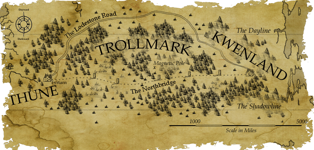
Exhibit 2 – the “antique” version of the Northbridge. This one was made for my worldbook entries, and is more of an “in-universe” map – specifically, the rather ambitiously speculative map that my narrator Farco Maldwyn draws up in his journal, based on the testimony of his guides.
My priorities: readability and atmosphere – I wanted it to look old and worn, so I took the original map and overlaid it on some olde-timey parchment paper. I’m pretty conflicted over keeping the scale bar… I doubt Maldwyn would have bothered to add that, but perhaps I could say it was added later by scholars.
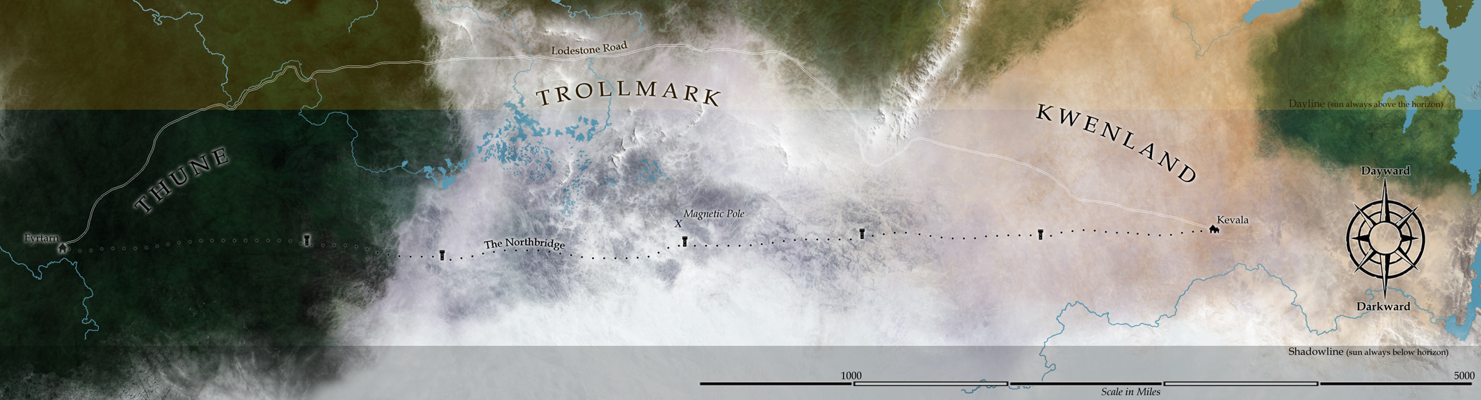
Exhibit 3 – The “satellite” version, aka “The Biggun.” Made because I have an abiding love of the lushness of detail in satellite view, and because I wanted an accurate picture of the north polar region of Bifrons. This is just a snippet of a larger map I made using an azimuthal equal-area projection of my base Bifrons map. I then did an overlay of Exhibit 1, made sure the scales all matched, enlarged to obscene proportions, and went to town with all my favorite brushes.
My priorities: consistent scale and sheer glorious aesthetics! It’s a lot harder to read at a glance, but all the detail is there for someone willing to take the time, it depicts the unique color you’d find in the Bifrons polar biomes (black taiga and purple tundra), and it’s soooooo pretty.
So everyone’s has their own particular *favorite style* of map. Browse r/mapmaking and you can see it breaks down into all sort of categories. Some people adore the real simple hand-drawn linework, or the iconic LOTR ink style. Others are all about the distressed parchment look, other still, the modern atlas.
Me? Deep down I’m all about the satellite look.
Nice top-down Google Earth style.
The problem as I may my “worldbook” -style info sheets, is that you can’t expect in-universe cartographers to be inking up satellite-style maps, surely. They’d be making 18th C style atlas maps, heavy on ink and low on color/accuracy. And I always love me some Tolkien-style mountains (I mean, who among us didn’t get into mapmaking from pouring over that LOTR map?)
So I compromised, and started making maps like these – sort of atlas-y, sort of parchment-y. Still some color to them.
But deep down, I knew it wasn’t enough for me.
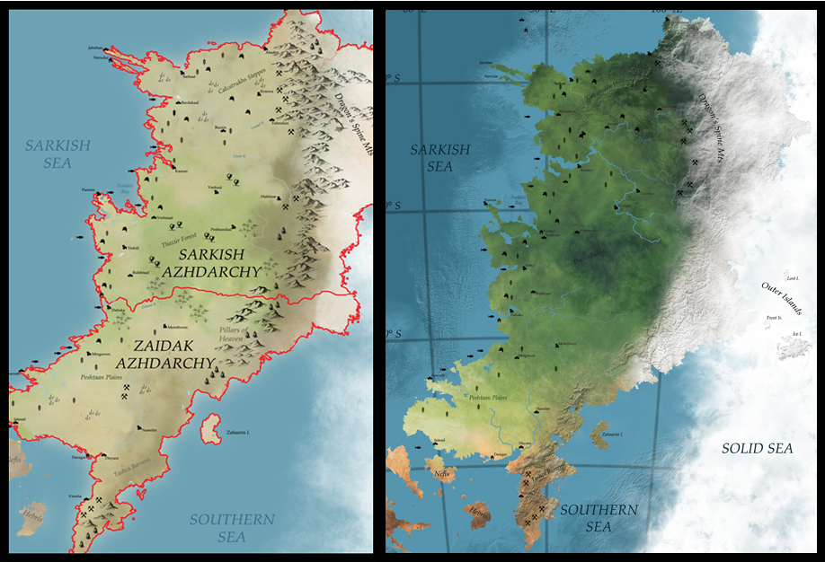
And then I bought some new Photoshop brushes. Behold the Evolution of Sarkland.
The age-old fantasy writer’s dilemma: how much of the world exists – both in your own head and more importantly, in the heads of your characters. If your setting is only medieval-level, it would strain credulity for all but the most exceptional navigator to have an accurate map of the entire globe (or flat sheet, or dome on the turtle’s back, etc.). Some writers only sketch out the immediate surroundings of their characters, then expand as need be. Many only reveal what is within the limits of their setting’s “known world.” (We’re still waiting to hear just how big Essos is, George!)
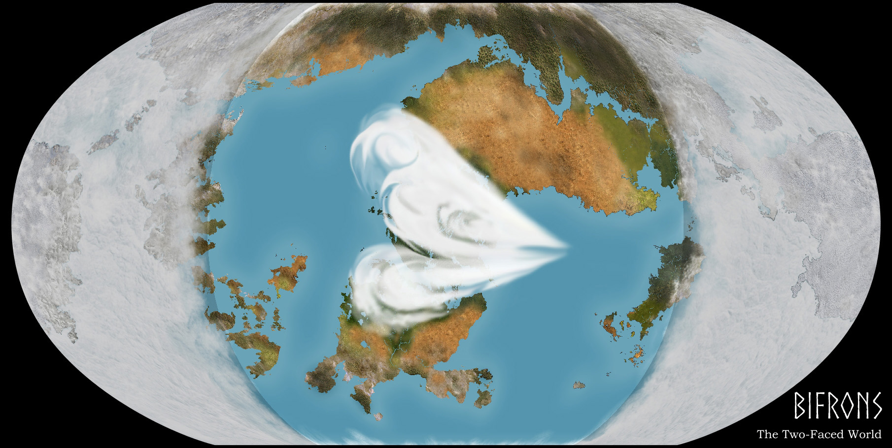
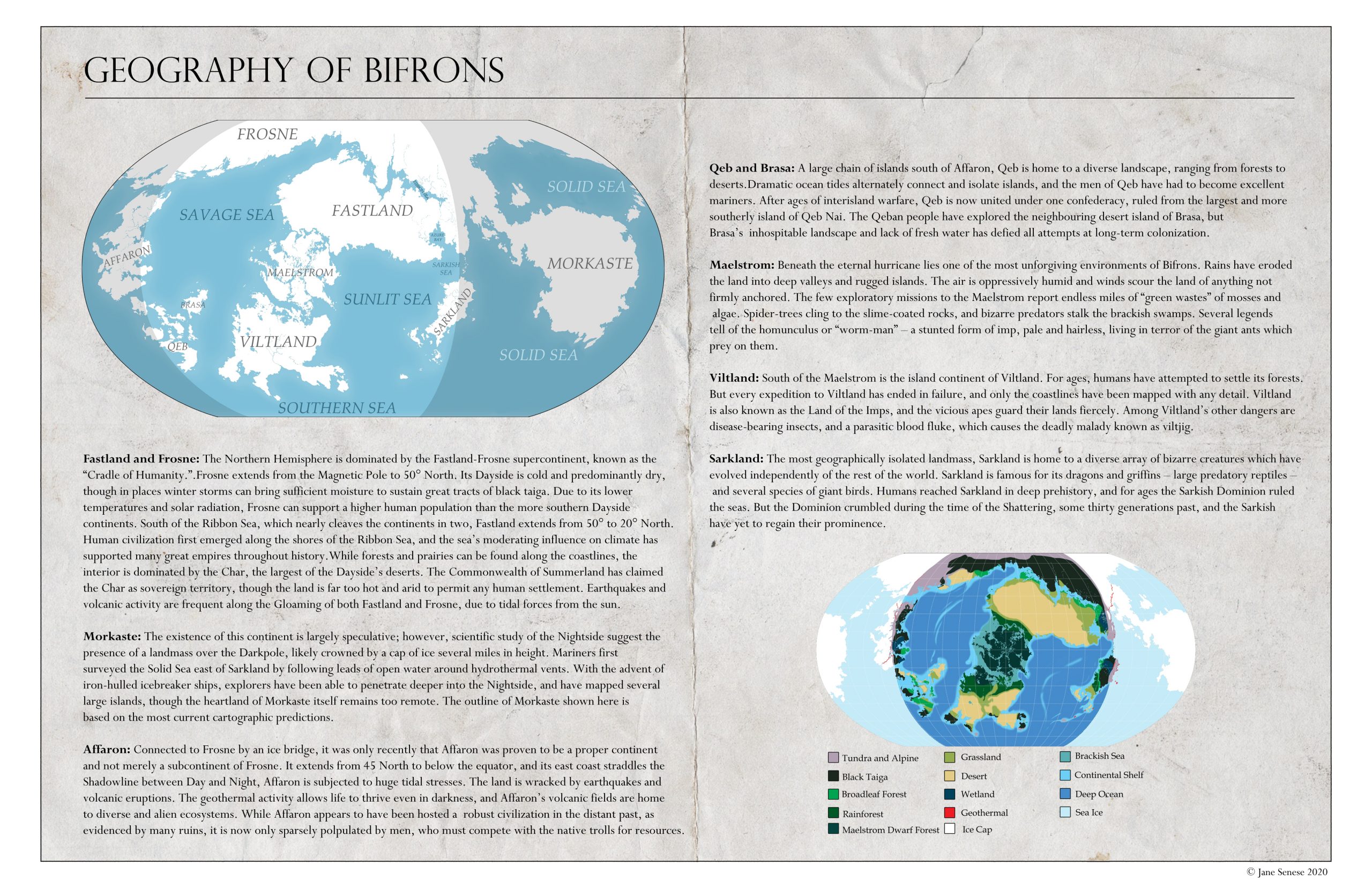
Personally, I work best as zoomed-out as I can manage. In fact, sometimes I zoom out WAY too much and have to reel myself back in. But with my tidally locked world Bifrons, I had a good excuse. It has has such varied landscape depending on longitude and light levels that you need to see the bigger picture. And the more I worked out the logistics of having late 18th century level tech on such a world, the more I realized the characters needed to know as much of the world as possible. With some small exceptions in the Gloaming, this is NOT a friendly planet. Resources must be carefully rationed and traded, often over huge distances. It stands to reason that the maps the inhabitants have are rather more accurate than anything we were able to have on Earth in 1800.
I debated making “in-universe” maps that show the globe with those nice “Here be Dragons” blank spots like our own explorers had. But having put so much work into making my coastlines, I didn’t want to consign them to the eraser tool. So I hereby decree the inhabitants of Bifrons hate blank spaces as much as I do. So they’ve filled in their globes to near-satellite precision. Whether it’s all accurate or not is another matter. No one will able to hike all the way to the middle of the Nightside and check for many generations.
All creators know the feeling: sitting on your work instead of releasing it into the aether. “What if it isn’t ready yet? What if I think of something else to add? What if there’s a mistake somewhere? What if I’m not strong enough to handle the feedback right now? Maybe I’ll just let it percolate a little longer. Just a little longer. One more proofread. One more beta reader/viewer.”
Eventually you have to take the plunge and hit post.
And then it happens. The work just isn’t good enough.
Oh, it might be just fine for the world at last. You might be getting some sweet feedback. You might even feel the warm glow of pride. But deep down you know, you can do better. You can do more. You can do it differently.
This is all a roundabout way to announce I’ve remade the fact files for my world Bifrons. Click to embiggen.
After lots of false starts and experimenting, I finally have a “look” I like for my “atlas” pages about Bifrons, the setting for my my upcoming novel East of the Sun.
The secret ingredient is love… and Photoshop to make the original map layout. Then G.Projector to turn it into a Robinson projection, and some more time in Photoshop to set up the page layouts.
Maps Are Life. I’ve always loved cartography. It’s genetic: I grew up on a diet of yearly road trips, watching my mom sitting shotgun as the Official Navigator with her pile of AAA maps. On a high school camping trip I earned acclaim for spotting the mountain we were hiking on a terrain map while everyone else was trying to find north. My favorite memories involve me correcting the onboard GPS after realizing someone got X Avenue West and X Street North mixed up. It is now understood that on family road trips I am the Official Navigator, and I take my duties very seriously – even if I’m looking on Google Maps instead of the paper ones.
But when I started work on the Ghost Town series, I found myself with a bit of a problem.
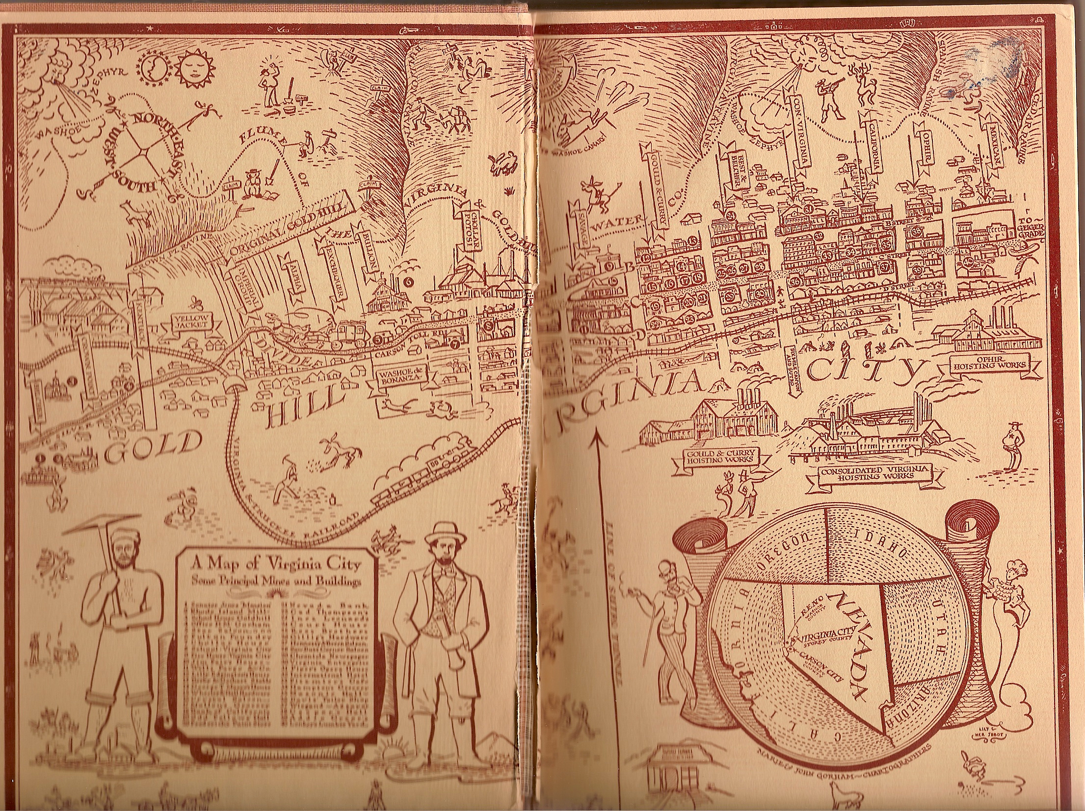
A Map of Virginia City by Marie and John Gorham. High on atmosphere, low on meat.
This was the first 1800s map of Virginia City I had to work with, found in a book I borrowed from obscurity at the University of Victoria library. It was utterly darling, and introduced me to several important Comstock concepts like the Washoe Zephyr and the V&T Railroad. But as the majority of the action was NOT going to be taking place in mining offices, I knew I needed something with more substance.
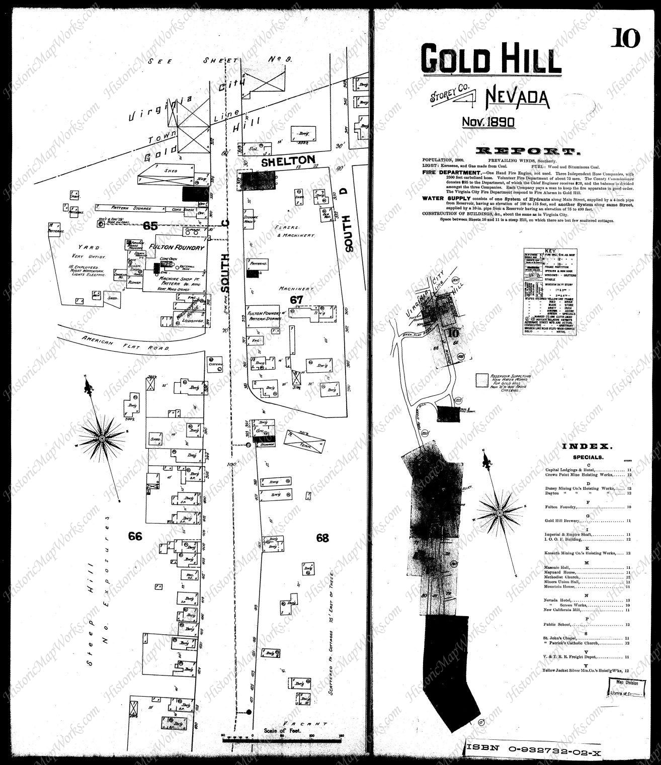
Survey map of Gold Hill from 1890, by the Sanford Map Company courtesy of historicmapworks.com
NOW we’re talking! A visit to Historic Map Works got me the survey maps of Gold Hill, and I knit them all together into my main source for all my cartographic plotting. I found out where Bill Crawford’s jail sat in relation to the Catholic church where Charlie was forced to hunt for husbands, and just how close the Yellow Jacket and Kentuck mine shafts were to the center of town. It showed me how many houses had already become abandoned, and I picked relatively uninhabited areas to insert my strictly fictional locations, like the Brennan’s Canyon Hotel and the Crown Point Livery Stables.
From there I was ready to move on to the really fun stuff: Google terrain maps!
Now I just need to overlay 1897s features on 2010s terrain.
While the mining has destroyed several topographical features over the years (RIP Crown Point Ravine), the streets of Virginia City and Gold Hill have hardly changed since the 1890s. So I generated some terrain maps and painted locations overtop.
For years this was enough for me, especially as I could not include maps in the actual novels. Working with my Frankensteinesque collection was more than enough to plot and scheme. But as I got deeper and deeper into the rabbit hole of Photoshop cartography, mapping out my new world of Bifrons, I knew I had to return to Gold Hill.
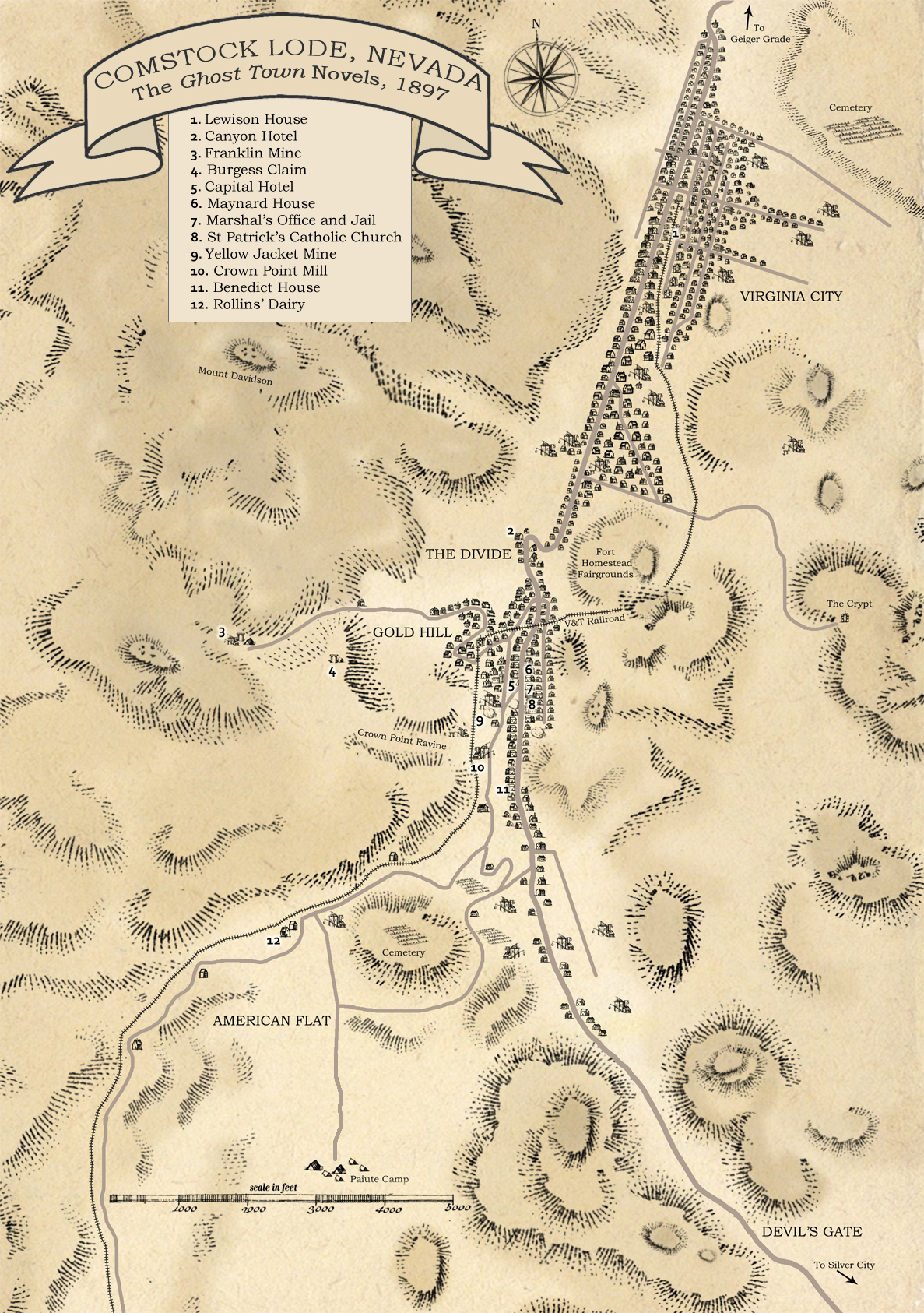
The Comstock Lode of the Ghost Town Novels (c) Jane Senese 2020
Using my terrain map as a base, and the wonderful brush packs of K. M. Alexander (a godsend to any aspiring cartographer), I finally have my definitive Ghost Town map. This one is an overview that works for all three novels, but I’m planning to make three specific ones for each story, with more detail. (I had to REALLY simplify Virginia City’s street plan to make it fit.)